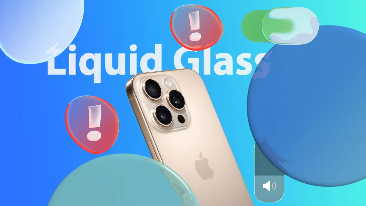

The recent launch of Apple's iPhone feature, known as Liquid Glass, has garnered a mixed response from users since its introduction last year. This redesign aims to create a more fluid interface that aligns with the device's rounded aesthetics; however, many have expressed dissatisfaction due to readability issues. Critics have noted that the increased translucency can obscure text, particularly when colors are similar to the background, making it challenging to read vital information.
During the beta testing phase for the latest operating systems, Apple made multiple adjustments to the Liquid Glass appearance in response to user feedback. The public release in November included iOS 26.1, which introduced customization options allowing users to select between a clear or tinted version of the effect. The clear option enhances transparency, while the tinted version offers increased opacity, improving contrast and overall legibility.
Despite these enhancements, users continue to report difficulties with text visibility across various parts of the operating system, including the home screen and app interfaces. The ongoing adjustments highlight Apple's commitment to refining the user experience with Liquid Glass, although some challenges remain.