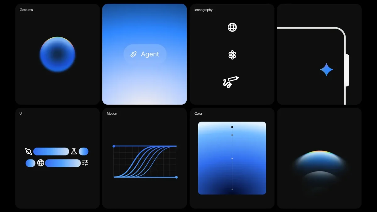

The design of the Gemini app by Google incorporates gradients to enhance user experience by guiding them into a new collaborative environment. This innovative approach addresses challenges in accessibility and visibility, reflecting the evolving nature of AI technology. The gradients serve as visual indicators, directing user attention to important elements within the app.
Google's exploration of design parallels the early days of the Macintosh interface, where icons transformed complex digital functions into intuitive visual cues. The design team aims to personify the AI assistant, making it approachable rather than intimidating. By utilizing gradients, they intend to convey a sense of energy and direction, contrasting with traditional physical objects represented by icons.
Highlighted features of Gemini include its live functionality and Android overlay, alongside animations designed for user interaction. The loading animation on the homepage is influenced by Material 3's expressive shapes, emphasizing a focus on simplicity and harmony, as seen in the app's logo derived from four adjoining circles.